Thursday, September 30, 2010

Halloween Wreath


I whipped up this wreath print and I am DYING to have it in my entryway this Halloween next to my embroidery of a witch. I am also dying to paint the entry walls this color:


Sort of a rusty, rich, pumpkin-y color. I'm trying to decide if this desire for orange in my entryway is just a result of it being autumn or if it's a color I could live with year-round. We'll see...

Wednesday, September 29, 2010

A Quarter Century of Me

As far as celebrating my own birthday, I don't usually toot my own horn a lot. But this birthday was exciting because I got a babysitter for my baby, for the WHOLE DAY, and I'm just spending the time doing whatever I want! I've been eating myself sick, watching Netflix, and...


Ta da! I finished the entire alphabet in my lace letters. I love how it turned out! Hopefully in the future I'll be able to get a few monograms of these in my Etsy shop! Regardless, it was a blast making these. Go to my flickr photostream to see more!

Tuesday, September 28, 2010

Pointless

When my little one goes down for the night and I pull out my sketchbook and fire up my Adobe software, my husband always wants to know what project I'm going to work on next. Or what project I'll pick back up after it's been lying around for a while, collecting dust.

This is one of those abandoned projects which I finished tonight. It's another letter. My husband also wonders why my designs normally have absolutely zero to do with the letters they represent.

The answer is: Because I feel like it! Seriously. I just like making pretty things. It's fun when things have a double meaning, but I don't shoot for that in all my designs. I just like to do what I want, the way I want.


That's why this letter M has nothing to do with a chandelier or jewels. I just made it this way because I wanted to. It's more fun.

Prison

Reason #1,000,000 why I love this little guy:


Before he saw the camera, he was distraught about accidentally trapping himself in this barstool/prison. Then he saw me smiling and taking photos and he cheered himself right up even though he was still stuck.

Monday, September 27, 2010

Halloween Series: Sneak Peek!

Holy Cow, I am excited about the illustrations I'm doing for Halloween. I'm getting started on them a little late so I'm not sure whether they'll be available in the Etsy shop this year, but I just caught the Halloween bug and I had to share my favorite one (so far).


Isn't it fun and girly? I just love it. It's almost un-Halloween-y enough to be out all year round. Love, love, love!

Back to School: Space

After last week's image, the H bird, involving line, I wanted to do something much simpler, but equally as awesome. And I'm not kidding. I want this on my living room wall right now...


...in between my husband's and my first initials.

And it's so simple, and it uses the most simple of design elements: Space. Now, in 3D art like interior design or sculpture, space gets a little more involved because you're dealing with foregrounds, middle, and backgrounds. In 2D art, usually there's just two things you've gotta deal with: Positive and negative space.

Seriously, easy peasy:


Arrange the positive and negative space in an attractive manner (more on that next week!) and you've got a winner and it doesn't even have to be complicated. Which is my FAVORITE.

Selah.

Wednesday, September 22, 2010

M

Earlier I posted this:
And said it wasn't in its final incarnation. I was right about that! The final incarnation turned out so fantastic, I had to share it.

HUGE improvement from my earlier version that was flat with Little Mermaid-y colors. I love this piece. The fact that there's an M in the design makes it that much more fun.

I'm pretty hooked on doing these letter illustrations. I may even make it through the whole alphabet! Keep checking back to see what's next.

Another Letter

I've been so enthralled with making things that are something cool but also look like letters. It's pretty clear what this letter is:


I'm pretty sure it's not in its final incarnation yet, but I wanted to share anyway. Plus I can look back at it and track my progress. I like the Japanese-y feel to it.

Monday, September 20, 2010

H Bird Poll

Voting on stuff online is so much fun. I decided to do my own little poll right here.

Which H bird is your favorite?

Grape


Tropical


Chili Pepper


Rust


Faded Denim


H Bird


I spent all day today (during naps) coloring this bird and I just couldn't resist posting. Line is great but color is awesome!

Wal-Mart

All right. I am not one to take many principled stands, at least in public anyway. But I wanted to share this link from one of my favorite fabric designers:

http://tulapink.com/2010/09/19/outraged/

Another reason, if you need one, not to give Wal-Mart your business.

Back to School Monday: Line

Good morning!

It's Back to School Monday! Remember when I said I'd do a post for each of the elements and principles of design? In honor of Back to School?

I didn't forget. So here's this morning's post. It was supposed to be all about Space, which was first on my list, but being the dingy person I am, I skipped Space and went right to Line.

That's OK because I LOVE this illustration of line. I'm pretty excited about it.
I was sketching in my book the other day, trying to come up with a fun, cute letter H for my ongoing Monogram project.

I like ongoing projects.

I have a lot of them. It drives my husband crazy. But for some reason my brain gets tired of a project before I can finish it, so I keep a big rotation of them. That way I keep from getting bored. And usually the ones that are really worth my time, eventually get finished. The other ones just languish in totes in my closet, or forgotten file folders on my computer, until I clean everything out about once every 5 years or so.

Anyway.

Line.

It's a bit of a challenge to work with just line all by itself. You want to add colors, or filled-in shapes, or SOMETHING.

I started with this sketch from my falling-apart sketch book:
As I said, the letter H. I love something that is also something else. Like a bird sitting on a branch, that is also the letter H!
I started to make a bigger sketch...
...and refine that sketch. A few times.

Then I traced it in pen. I messed up a couple times.
Eventually, though, I got it.
Holy. Cow. So. Stinkin' Cute.

I might name my next child an H name just so I can put this in his or her room.

Just kidding. Maybe.

What I ought to do is a whole alphabet along this theme.

Anyway, I think that the key with LINE is that you have got to do SOMETHING with it to avoid making it look flat and totally boring.

There are a few ways to do this, but I think that the best, most fun way is to vary the thickness of the line. It's a little bit more subtle in this illustration, but you can see it. With my illustrations, a lot of times I like to add a thick line around the outside of the illustration. It's a trick I learned from all those Disney movies I watched as a kid.

There is definitely something totally great about forcing guidelines upon yourself once in a while. I don't have a lot of constraints in my life when it comes to design, so it's good to make myself step back and follow a few guidelines sometimes.

And, now, lucky you! My baby just woke up so that puts an end to today's post.

Go make your own line piece, I dare ya!

Tuesday, September 14, 2010

Corny

I'm taking a day off from designing today to get elbows deep in corn.
Yum.

I'm chopping it off the cob and then cooking and freezing it. It's a laborious process, one that usually happens in my grandma's barn, but it's hard to get a truckload of corn shucked, cooked, and dumped in freezer bags in your grandma's barn when you have a baby holding onto your ankles.

So my baby and I are just doing it at home this year.
A couple jalapenos might sneak in there somewhere, too. They probably won't make it to the freezer, though.

Monday, September 13, 2010

Back to School

There's a nip in the air, leaves are starting to fall, we're harvesting things from the garden...

And all the kids are going back to school.

It makes me jealous. I have mostly loved school in my life. Up until sometime in high school, I would wake up excited for the coming school day. Not surprisingly, the point where I began to dislike school was also when my grades dropped. I was still a good student, but I'll always remember that one math class that I skipped about 60% of the time. I would only show up for quizzes and tests, the rest of the time I would go to the library and read.

I'm still not a fan of math. In fact, my personal opinion is that schools should stop requiring years of algebra, trigonometry, and calculus. If I were to become queen over America's school systems, I'd make sure schools offered math classes that focused on building the math skills needed to manage personal and business finances. More of an accounting focus rather than a scientific one.

That might possibly be a bad idea. It's a good thing I'm not queen of the schools. But I personally never used most of my limited algebra skills in my life after high school. I would have been far better off graduating high school with a knowledge of how to balance my checking account rather than knowing how to reproduce the Pythagorean Theorem.

I'm way off topic though. This is a blog about art and design, for pete's sake!

And it's back to school time.

In honor of that, I'm giving myself an assignment.

Every week, I'm going to post an example, created by me, of each of the elements and principles of design. I'm hoping it will help me brush up on my design skills. It's easy to get sucked into fads and gimmicks.

Asymmetrical Balance

This assignment I'm giving myself is a rip-off from one of my college classes where we did this very thing. At the end of the semester, I had a binder full of
little cut-paper examples of design elements and principles.

The binder was subsequently commandeered by my design professor, and last I checked, she was using it to teach her class. The image above was the only one I was able to rescue.

That's a point of pride with me. I sorta, kinda made a textbook that students still actually look at and learn from. It makes me not mind so much that I don't have it any more.

So there you have it. Keep checking back to see whether I've turned in my assignments! And to see whether they deserve an A or an F-!

Tuesday, September 7, 2010

Straight from My Sketchbook

The other day I was digging through one of my many disorganized drawers full of art-related materials, and I came across this:
It's an intaglio print (dry etching--at least I think that's the term. My memory fails me sometimes) of an abstract bunch of windows on a skyscraper. It was inspired by my experiences in Eastern Europe. I lived in several different places--all big cities-- but the view was invariably the same-- miles and miles of old Soviet style apartment buildings. It was fun to see all the different windows in these apartments. Some had bars to discourage break-ins. Some had clothes hanging out to dry. Some had potted plants. Others had windows that looked like they belonged in a bus. There was always someone hanging out at least one window, cigarette in hand.

I would look out those windows and wonder what kinds of people lived behind them. I love the idea that every person's life is a story worth hearing, that everyone has their own personal joys and tragedies, achievements, and mistakes made. I would always wonder, looking at someone, what their story was.

I got to hear a lot of stories, and I loved them all. I really treasure the times I got to sit around with a cup of tea (herbal for me), vodka (juice for me), or vareyniki (second helpings for me!) and just listen. I could write a book on all the stories I heard.

I'm getting off topic, though.

The other night my baby was asleep and my husband went out for a much needed boy's night, and so I was home alone to do whatever. I pulled out my Windows etching and my sketchbook. I wanted to do more on the theme of windows. After a while, I had several similar to this:


Then I refined my sketch just a little, plugged it into Illustrator, as always, and came up with this.

The script, one of my favorites from The Sound of Music, says, "When God closes a door, somewhere he opens a window."
There you have it. I think I'll try to push this one a little further. I'm 100% positive that the version you see here isn't in its final state. I'm leaning towards adding more windows, and having it be more similar to the Windows etching. Plus the vignette is bugging me. I blame that on Sister Jimison, my printmaking professor. She was always telling us to "activate the edges" of our images. Best design advice ever, even though it is always haunting my thoughts!

So. Windows. Yes. Love them. And now, since my allergies are giving me fits and I can barely stop sneezing long enough to write this, I think it's time to take a Benadryl and call it a night!

Sunday, September 5, 2010

Shrooms

OK, I have to admit, as I'm looking at the above image, I'm realizing what huge drug overtones I've given to this illustration. Oh, dear. It seriously wasn't on purpose. I feel so dumb now! I was thinking along the lines of food and how I just like mushrooms.

I made this little illustration because I just needed a break from doing dishes/other, more serious, more taxing design projects. I've had the little mushroom in my sketch book so I traced out the imperfections, scanned it into illustrator, and went to work playing with the colors and composition. And then I started thinking about how sometimes I like to eat mushrooms. How fall is coming and it's the perfect time to start incorporating something warm and mushroomy into our diets. At the same time, I wanted to add a typographic element to the design, too. At first it was the word "mushroom" but how boring is that? So I came up with something a little more creative. So, yeah, this was meant to be more of a food related thing than an advocacy for drug use.

Believe me, nobody is more of a non-druggie than me. If you know me, you'll know this is a fact. I've always sort of been a goody two-shoes. And I like it that way. It keeps me right where I like to be--out of trouble. I've never been offered drugs, and being the straight-laced girl that I am, I probably wouldn't have taken them anyway. I'm just that way.

ANYWAYS. I think it's funny how sometimes themes that are TOTALLY not me at all, come out in my work. I wonder why that is?

Also, I'm thinking this illustration could spawn a whole slew of food-themed, '70's posters. To match all those avocado appliances out there. Or mustard colored sinks, like the one in our apartment right now. Fun!

Wednesday, September 1, 2010

How To: Altered Book Inspiration Journal

I woke up this morning super tired and not feeling quite up to my schedule of cleaning, laundry, diaper changing, cooking, and designing in the free moments between it all. My boy was up last night what felt like about 40 times an hour, but I won't complain.

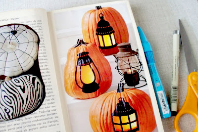
So, this morning when I woke up from a practically sleepless night, I just wanted a little change, some sort of project I could do in a very short amount of time. At the same time, I've been admiring some photos in a magazine of antique Halloween items. I wanted to save them but didn't really have a feasible, neat way to do it... Until now.

If you want some sort of journal where you can just paste in bits of inspiration, photos, or notes, this would be perfect. First, you need a book. One that you won't want to read later on.

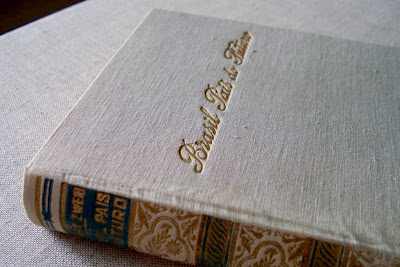
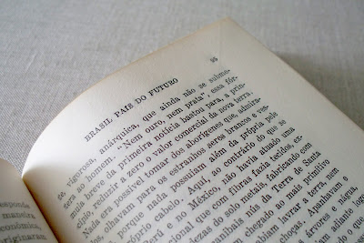
Mine is a 1941 Brazilian book, entirely in Portuguese, and seemingly having to do with the socio-economic future of Brazil... I think. I got it a few years ago at my college library's semesterly book sale for like 10 cents or so. I liked the spine of it, and figured I'd do something with it someday.
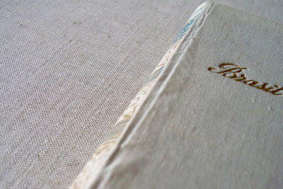
It isn't in super great shape. But for my purposes, it'll work.
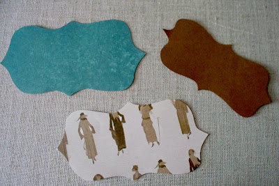
After you've gathered your book, you'll need to cut out three shapes, each slightly larger than the next. I freehanded these--But feel free to use circles or squares or hearts or whatever you want.


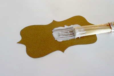
Then I glue 'em all together. The smaller shapes go on top. I used Mod Podge for this project, but I don't know why Elmer's wouldn't work, too.

Then I put another layer of glue on the bottom shape and slap it on the book:


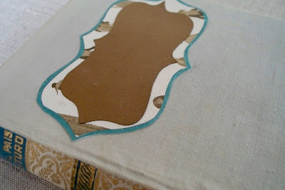
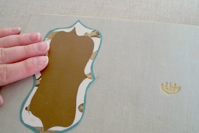
You might have to rub it down a couple times until the glue sticks.

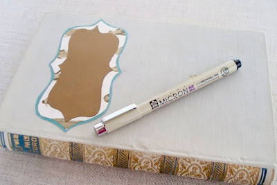
Next, grab your trusty Micron pen. I love these pens. They're awesome. They're also about $3-$4 apiece so if you feel like you don't want to spring for the Micron, you can also go with your computer and printer, or a Sharpie. Either way, it'll look great.
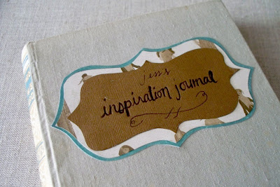
Then write whatever you feel like on the cover. This cover may become more and more decorated as time goes on. It just depends.

It was a little bit of an off day for my handwriting. Oh well. I'll probably eventually doodle on the cover of the book until it becomes unreadable.

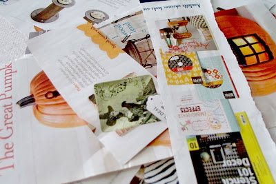
Next, pasting things INSIDE...
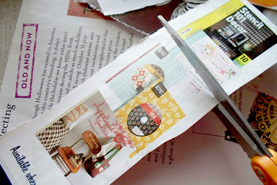
Grab your magazine clippings, and cut them up.
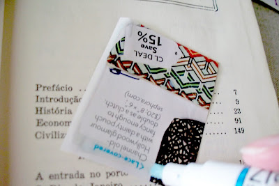
Then grab your Zig 2-way glue pen. I know I'm using a lot of brand names in this post, and even if you don't want to do the Micron thing, I'd really recommend a Zig for the inside pages of your inspiration journal. It's not messy, it won't bleed out, it dries fast, it stays sticky, and it doesn't warp the paper. You can get them at any craft store in the scrapbooking section.
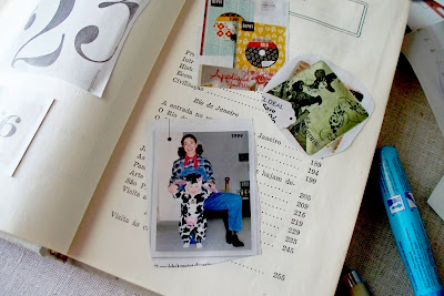
And glue to your heart's content!
I'm pretty sure I'll have this filled in no time, especially since I always end up ripping pages out of magazines every time I go to the doctor's office.

I'm terrible. I know. It's terrible. I guess that's the price that my doctor pays every time he makes me wait in his waiting room longer than 30 minutes. I start to get antsy. My eyes get shifty. I pick my nails. I look at the split ends in my hair. It inevitably spirals out of control until finally I'm surreptitiously tearing pages out of the waiting room magazines and stuffing them into my purse until I hear my name called.

And no, the pages of this particular magazine were not stolen from the doctor. They came from a magazine that I actually own. Just thought I'd clear that up.

Please don't be a thief like me. Do make the inspiration journal, though. It's awesome, neat, and it'll keep your baby from eating stray magazine cutouts that fall out of your purse and into your kid's waiting hands.