First, this hideous frame that I bought for $4 at a thrift store. It looks like metal but it's really some kind of wood, with splatters of a gluey gold substance all over it.
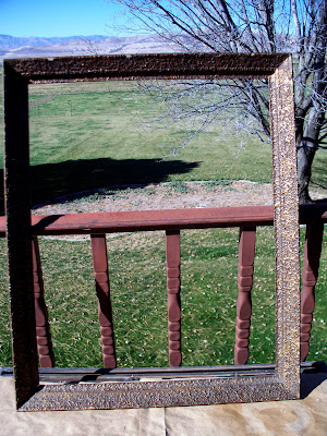 The gaudy gold frame came along with a truly frightening painting of a jester, mounted very unfortunately to the frame's backing. That means the jester will be staying with this frame for a while.
The jester is disturbing. I might post a photo of it, if I ever get to taking it back out of the frame and photographing it. Maybe as a special Halloween post? We'll see. Just trust me. It's scary.
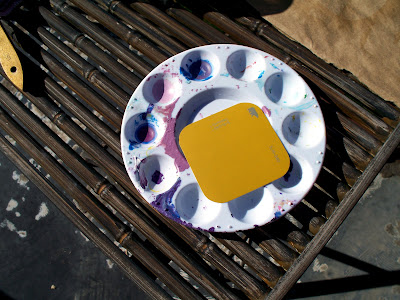 Next I chose the color I wanted to paint the frame, which was a deep gold. Kinda funny, since the frame is already gold.
Yes, my paint palette is always that messy. I hardly ever scrub it. I've got better things to do.
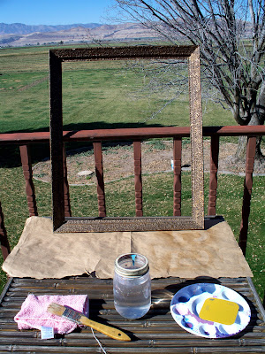 I was lucky to get this project done right before a big rainstorm rolled in and dumped on us for two days.
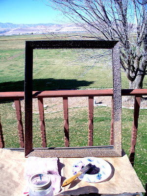 OK, so, first, I painted half of this frame black. Mars black. Mars black is a little softer black than the other shades I've worked with. It's great for what I had in mind with this project.
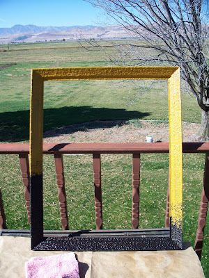 Next came the gold. I turned the frame the other way and painted the other half with my gold paint, staggering where I stopped the paint. The gold color came out weirdly bright in this photo.
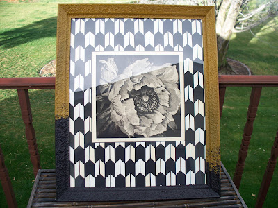 Oh, that's better. This is what it looks like in real life. When the frame dried, I sprayed it with a coat of varnish and then added my mat. I felt like the artwork needed a little oomph, so I added this arrowhead pattern. It has caused very mixed reactions around my place. I absolutely LOVE the way it turned out, but my husband HATES it. Who knew it would be so polarizing?
Oh, by the way, the poppy artwork isn't mine. I took an intaglio printmaking class and traded one of my embossings for this aquatint. Isn't it beautiful? I really got the better end of that trade. In fact I remember that the girl I traded it for wasn't too happy about letting it go, because the plate was so big and difficult to print. And she'd worked on the image for a long, long time. I tried to find out if she's got a website, but apparently she doesn't, which is a shame.
Now for the Back to School Monday part:
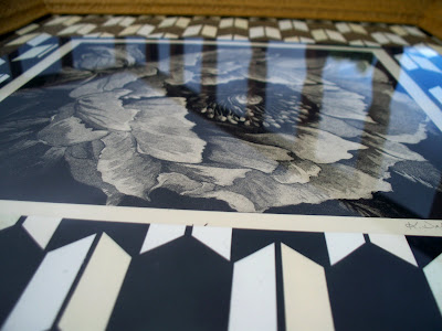 Unity and variety.
I'll make this short and sweet. Obviously the unity in this piece comes from the matching shades of black and cream. The juxtaposition of the organic shapes of the flower and the more bold, graphic, geometrical shapes on the mat, give it some variety.
Unless you're my husband, and then you might think it's just plain ugliness, who cares about the design gobbledegook?
And, as a last aside, I've got to say, after all my hard work I was a little hurt that my husband didn't like this. Maybe you don't like it either. But you know what? It's like that episode of The Office (sorry, I can't help it with the Office analogies sometimes) where the coworkers are arguing over what they should buy with their budget surplus-- new chairs, or a new copier. Pam and Jim, the office's engaged couple, are on opposite sides of the debate. And there's this one part where Jim starts explaining to the camera all the reasons why he's right wanting a new copier and Pam's not because she wants chairs. Then-- I love this-- he stops himself short and says, "You know what? Pam and I don't have to agree on everything."
That's exactly how I feel about this. So I'm going to quit yapping about it and go IM some kind words to my wonderful husband, who is miserable with bronchitis right now but is at work today anyway because he's a trooper who works really hard for his family.
Enough said! If you liked the frame redo, I hope you'll leave a comment! It'd be fun to know it's not just me!

No comments:
Post a Comment