Wednesday, December 22, 2010

Flourish


OK, so I fully intended to sort of take it easy this month, at least as much as you can take it easy with a one-year-old around. But that didn't happen. Uh-uh. Not a bit. Why? It's because I have an illness...

That's right, I've been infected with the current rage for monograms (check out the ridiculous paper cut E!). I have been spending the past few weeks obsessively looking at fonts and dreaming up new ways to enlarge them and get them on peoples' walls!

FINALLY after weeks of experimenting, painting, cutting, printing, and gluing, I have something to show for it!

I like to have options, so I've done several fonts and I plan to eventually finish every letter of the alphabet in each typeface.

My favorite has been doing this font. Holy moley. It is great. I'm in love. I love the antique-y feel to it! (Best thing, if you register at Veer you get 10 free credits and you can get it for free!)

Anyway. You should go check out the new doin's over at my Etsy shop. I posted a few new things today, and you can bet that as soon as I recovery from Christmas, and venture into the big city to buy more Mod Podge and double-thick chip board, you'll see more! More fonts, more colors, more letters!

Also, if you feel the need for a letter or color and it's not in my shop, I welcome custom orders!

On that note, MERRY CHRISTMAS! Thanks so much for stopping by!

Friday, December 10, 2010

Grandkids


Lately I've been obsessed with taking some of the wording from those popular vinyl rub-on plaques, you know the ones? Well, I've been obsessed with taking the wording of those plaques and making it a little more... interesting. Not that there's anything wrong with vinyl plaques. I even have a couple in my own house. However, I personally get bored with the same old white, cream, or black wording on a painted board. I love the sentiments. I'm a total cheese. And the humor in some of them, too, like the one in today's post. I just wish they had a little more pizazz.

Of course, I had to try and put the pep into those quotes and sayings myself. I have to say, I'm pretty excited with all the results. It's been fun, and the Grandkid design is no exception. Again, I drew all the lettering myself. I could totally see this hanging on my in-laws' wall. My son's Bubby and Zaida (Yiddish for Grandma and Grandpa) have a fun, wry sense of humor and this little saying just totally reminds me of them.

Enjoy! Hopefully I'll get it, or some rendition of it, up in my etsy shop soon. I've got so many things to put in there, and so little time! And so much Harry Potter to read before I go see the new movie!

PS it occurs to me that this design would look SO CUTE as a primitive stitchery pattern... Hmmm...

Wednesday, December 8, 2010

Real Men

This blog has been so neglected lately! Honestly, I've let it go a bit this holiday season because... well, the holidays can be a bit stressful. Am I the only one who feels this way? There's so much cooking and shopping and visiting and decorating... It all can get kind of overwhelming. I figured my to-do list was long enough and something just had to go!

I'm still at it, though. I'd like to share this new artwork. I want to get a print of it in the shop very soon!

This is dedicated to my husband, who loves to cook, is a marvelous chef, and saves me from making dinner several times a week. Not to mention, he cooked me a fancy, romantic by himself the night he proposed, and all through our honeymoon.

So this has a bit of a soft spot in my heart:


I drew all of the type myself, which was a bit of a new challenge for me. It took time for me to be able to build up the confidence to even attempt to make my own typography, and I have to say I am pretty happy with the result. It was a lot easier and more fun than I thought! I can guarantee I'll be doing more of this type of work in the future.

Here's to my honey who makes my life better every single day.

And to all of you, thanks for reading this blog, and I promise I will be back full force after I recover from the holidays!

Saturday, November 6, 2010

One Year

My baby turned one today.


I've been close to tears all day. It seems like not long ago, our lives looked like this:


This was him a year ago.


He was born a preemie. I got to hold him for about 10 seconds after I had him. Long enough to take this picture, then they whisked him off to the Newborn ICU. My husband really got the short shrift, I don't think he had a chance to even touch him.

The next 2 weeks were tough. The smooth birth and healthy baby we were expecting didn't happen. That was hard. And, um, so were the next 6 months or so. We made it, though!

What a cutie. I wouldn't change a thing about this year. It's been a big learning experience.


Seriously. How stinking cute is he?


I just love my little guy. Wouldn't trade him for anything. Happy birthday, baby!

Friday, November 5, 2010

My Christmas gift to you

Hi! I realize it's been forever since I updated! Life is crazy busy right now. I feel like I can't catch my breath sometimes between my bronchitis-stricken husband, baby's birthday and teething, preparing for the holidays, plus a couple other big projects that I'll let you in on sometime soon.

Anyway, this is a week late, but better late than never! I finally finished the pattern for the Nativity Set! I had all these grand dreams of figuring out how to embed the file in my blog, but it turned out to be too overwhelming. I'm not really a tech genius. But, it's over at Scribd so you are welcome to it! It's my Christmas gift to you.

As a warning: This is a big project. You'll want to devote a couple days to this puppy. Maybe one day if you don't have any babies grabbing your ankles.

I've had some requests for me to make this for people. I just sold one the other day, in fact. If you'd like me to just make you a nativity set, I'm happy to do it. You can email me for prices.

OK, we need to take a look at this darling set. This is the one I sold this week:

Wise Men...


Shepherd...
Mary and Joseph and of course Jesus...


And the angel. I should've gotten a shot of the back of her, because that's really the best part. I put stars on her back, they're very cute. It occurs to me now that I didn't say anything about them in the pattern, either. Whoops. Well, I know my readers are smart. I think they'll be able to figure it out!

So anyway, that's it! Go grab the pattern right now because I've got plans for it next year, which DON'T include giving it away! So if you procrastinate, you'll be sad next year when it's not available.

Just go get it now. You'll want to start now anyway since Christmas will be here in a trice!

Monday, October 25, 2010

Back to School Monday: Unity and Variety + Frame project

Because I like multitasking, I made this Monday's post a two in one. The first part is the project I did this weekend. The results tie in nicely with the Back to School post, so that'll be last!

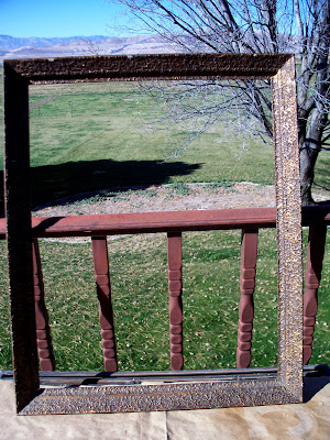
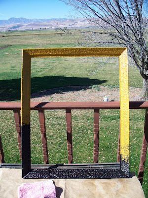
First, this hideous frame that I bought for $4 at a thrift store. It looks like metal but it's really some kind of wood, with splatters of a gluey gold substance all over it.

The gaudy gold frame came along with a truly frightening painting of a jester, mounted very unfortunately to the frame's backing. That means the jester will be staying with this frame for a while.

The jester is disturbing. I might post a photo of it, if I ever get to taking it back out of the frame and photographing it. Maybe as a special Halloween post? We'll see. Just trust me. It's scary.

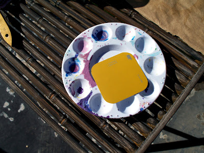
Next I chose the color I wanted to paint the frame, which was a deep gold. Kinda funny, since the frame is already gold.

Yes, my paint palette is always that messy. I hardly ever scrub it. I've got better things to do.

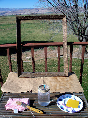
I was lucky to get this project done right before a big rainstorm rolled in and dumped on us for two days.

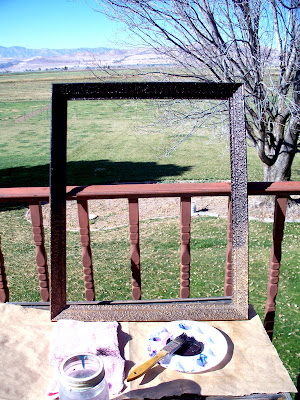
OK, so, first, I painted half of this frame black. Mars black. Mars black is a little softer black than the other shades I've worked with. It's great for what I had in mind with this project.

Next came the gold. I turned the frame the other way and painted the other half with my gold paint, staggering where I stopped the paint. The gold color came out weirdly bright in this photo.

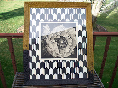
Oh, that's better. This is what it looks like in real life. When the frame dried, I sprayed it with a coat of varnish and then added my mat. I felt like the artwork needed a little oomph, so I added this arrowhead pattern. It has caused very mixed reactions around my place. I absolutely LOVE the way it turned out, but my husband HATES it. Who knew it would be so polarizing?

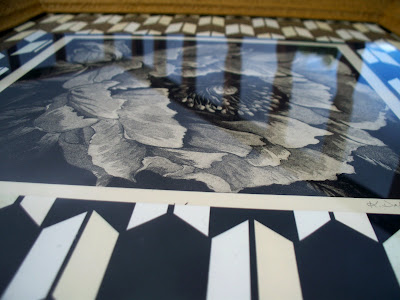
Oh, by the way, the poppy artwork isn't mine. I took an intaglio printmaking class and traded one of my embossings for this aquatint. Isn't it beautiful? I really got the better end of that trade. In fact I remember that the girl I traded it for wasn't too happy about letting it go, because the plate was so big and difficult to print. And she'd worked on the image for a long, long time. I tried to find out if she's got a website, but apparently she doesn't, which is a shame.

Now for the Back to School Monday part:

Unity and variety.

I'll make this short and sweet. Obviously the unity in this piece comes from the matching shades of black and cream. The juxtaposition of the organic shapes of the flower and the more bold, graphic, geometrical shapes on the mat, give it some variety.

Unless you're my husband, and then you might think it's just plain ugliness, who cares about the design gobbledegook?

And, as a last aside, I've got to say, after all my hard work I was a little hurt that my husband didn't like this. Maybe you don't like it either. But you know what? It's like that episode of The Office (sorry, I can't help it with the Office analogies sometimes) where the coworkers are arguing over what they should buy with their budget surplus-- new chairs, or a new copier. Pam and Jim, the office's engaged couple, are on opposite sides of the debate. And there's this one part where Jim starts explaining to the camera all the reasons why he's right wanting a new copier and Pam's not because she wants chairs. Then-- I love this-- he stops himself short and says, "You know what? Pam and I don't have to agree on everything."

That's exactly how I feel about this. So I'm going to quit yapping about it and go IM some kind words to my wonderful husband, who is miserable with bronchitis right now but is at work today anyway because he's a trooper who works really hard for his family.

Enough said! If you liked the frame redo, I hope you'll leave a comment! It'd be fun to know it's not just me!

Monday, October 18, 2010

Excuses, excuses!


Hey!

The reason I haven't posted a Back to School Monday entry is because... My son has been hogging my computer all day!

Just kidding.

I just haven't had time for it today.

It's going to get done eventually, though! Even if they're useless to everyone else, I learn a lot, or remember a lot, from doing the Monday posts. But today, it just didn't happen. Between my boy not napping, a bunch of new projects in the works for my Etsy shop, and going on a wild goose chase to glean potato fields, well, Back to School Monday will have to wait!

In a few days, I'm going to add some new stuff to my Etsy shop! I'm really excited about it, and it has not seen the light of day on this blog, so it's totally fresh. I'll keep it under wraps until I can debut it in my shop.

Bye for now!

Thursday, October 14, 2010

Opinions Wanted: My Entryway

This is the entryway of our apartment:


We rent. I have to be nice in this post because our landlord is also my husband's father.

I actually really like our apartment. Honestly, I do, and I'm not just saying it for my in-laws, even though I'm pretty sure they don't read this blog. It's a perfect situation for us. The rooms are very large and it has its own washer and dryer. It's also very architectural and rustic, which makes sense for our rural Utah location. I'd take photos but my house is a mess. There's a big raw brick fireplace and raw wood beams all over.

The only thing that I itch to change...

The paint.


It's white. There's nothing really wrong with white. But I long for color on my walls, especially since there's so much wall. And the rest of the apartment is, like I said, very warm and rustic. So white just doesn't belong, in my opinion.

So for the past while I've been thinking about paint options, and finally today I snapped a picture and slapped up some fake paint in Photoshop.

At first I wanted to do a rust orange color, sort of like this:

It might be a little peachy, but you get the idea. The problem is, our kitchen walls are covered in rust colored countertop stuff. What is that countertop stuff? Formica, maybe? I'm not very knowledgeable about these things.

And since our kitchen directly adjoins the entryway, I'm thinking it might be orange overload.

Then I thought about yellow...

...and a neutral. This would be, in my opinion, the fool-proof color. It's neutral, smart, and it will go with any season or decor, both of which change often around here.

I thought avocado might be neat, too. I thought it could be a good complement to the orange kitchen. On the other hand, it might be straying way too far into tacky '60's land.

I think I'll put this one up to a poll. Which color should I paint my entryway?


Tuesday, October 12, 2010

DIY Nativity project coming soon (psst... it's free!)

Lately I've been in the throes of Halloween decorating. I've had Halloween on the brain lately. Then I realized that if I'm ever going to be ready for Christmas, I'd better get in gear.

Last year I came up with this cute, fun idea for a Nativity set. I had my dad cut the wood for me (My dad is amazing at woodworking. He built my mom a gorgeous dining table FROM AN OLD TREE STUMP. A tree stump, people. It is seriously amazing.)

Anyway. I planned last year to make these for a friend and then my baby was born a month premature and was in the Newborn ICU for two weeks, so that pretty much put the kibosh on crafting. Plus it was a nativity set and at that point in my life, I could not think about anything baby-related without breaking down into a hysterical, hormone-induced crying jag.

I'm better now.

This year, my kid isn't in the hospital and he actually takes naps sometimes, so I got to finally finish my Nativity project.

I've thought a lot about what to do with the pattern. I didn't want to do all the work drawing up the patterns for my Nativity set and have me be the only one to ever have access to it. So, I've decided to offer it for free on my blog! Exciting, no?

Hopefully this will be the first of MANY giveaways on this blog. I thought it was fitting to start with a Christmas freebie since the holidays are the season of giving!

Want to meet some of the characters? While I made them, I thought a lot about what their personalities might be like, and tried to incorporate that into my designs.

(By the way, I'm REALLY sorry about the photos. They were taken in a dark room, with a digital point-and-shoot. Someday, someday, I will have the fancy professional camera I dream of. For now, we've got to make do with this.)

Here's Joseph. He's the strong, silent type. His garb is simple but he'd do anything for Mary and Jesus.

This is Mary. She's beautiful, loving, and kind.

The Shepherd. He spends most of his life outdoors, roaming around the fields with his lambs. He lives a simple life. He does his own mending.

The first Wise Man. He's a tribal king from somewhere in the plains of the Orient. He's a gold miner and he's brought a big chunk of it as a gift.

This Wise Man is from the mountains. He's built his kingdom on the incense industry.

The third Wise Man, I imagine, is a seafaring man who's bringing (you guessed it) myrrh from his travels.

Each character is showing reverence for the event they're witnessing.

I'm still working on the angel, some of the animals, maybe another shepherd, the star, and of course baby Jesus. I'll post the rest of them as soon as they're finished, I promise! Following that will be the patterns for every character.

Now. This will all be up before the end of October so that you'll be able to finish your own set before Christmas. I'd give myself an entire day to get everything cut out and glued.

What you'll need to gather if you want to make the Nativity set:

Wood: I used 2x4's. They were scraps, about a foot long or less. The patterns are EASY to lengthen or shorten, so I wouldn't worry much about the length of your wood. I got my wood from my dad's scrap stash, but I hear that Lowe's and Home Depot have scrap bins, too, if you don't have a woodworking person in your life.

Someone to saw the wood: I drew right on the wood. You can see how it should look. Basically the head is shaped like a half circle. There's no exact science to this.

Paper: You'll need scrapbook paper. This is a great project if you've got lots of scraps. You'll need a little bit larger pieces for the bodies of all the characters. If you're buying, I'd estimate about 1 12x12 piece of scrapbook paper for each character, and about 3-4 12x12 pieces for the star. Various colors and values (by value I mean light or dark, not money).

Also necessary:

Sandpaper
Glue gun
Dowel
Mod Podge + brush
Glue stick or pen (I recommend Zig 2-way glue. Find it in any craft store)
Pencil
Eraser

These supplies are pretty basic, I'm betting that you've already got most of this stuff if you've done crafts before.

Keep checking back, and don't forget to like me on Facebook. That way you'll know when I've got the next installment of this project up!

Monday, October 11, 2010

Back to School Monday: Texture PLUS a mini-tutorial!

Today's post is FUN!

Well, I think it is, anyway.

We're talking texture. I use it a LOT. Especially in my digital illustrations. Why? Because it just wakes things up. Digital illustrations can feel really spare and boring to me. A lot of times, they need something to just wake them up and add the feeling that they were created by an actual human being.

I saved one of my digital illustrations mid-stream so you can see what I'm talking about:

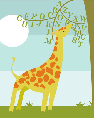
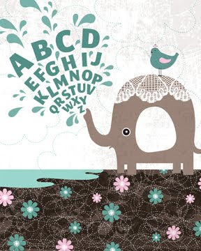
This giraffe illustration is in the same idea as this, one of my most popular illustrations:

The elephant also has lots of texture.

Anyway, check out the difference between the giraffe illustration before texture...
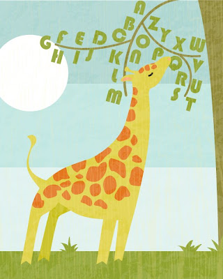
And after texture...
(Also I changed the font, but that's something for another day.)

Better, no?
I am DYING to add this print to my Etsy shop. Hopefully soon! I'd order it right now, but my printer gives me a discount if I order a certain dollar amount worth of prints, so I like to wait until I can get my discount. That's the miser coming out in me. If there's a discount to be had, I'm there.

Oh, and if you're an illustrator also, and you wonder how to get texture? It's easy. You can find lots of tutorials online, but it basically these steps:

1. Take a photo. The textures for my giraffe were made from two photos, one of wood and one of rough cement. The ones for the elephant were from some old lace and a cookie sheet. There are textures all around you, your wall, your street, the side of the building you live in. Seriously, if you look, they're everywhere.

2. In photoshop, adjust the levels to a very high contrast. Blow it out.

3. Convert your image to black and white.

4. Save your image as a .tif.

5. Open your .tif in Illustrator.

6. Select your image, then Live Trace it. This can take a while if your computer is older and slower like mine is.

Ta da! You've got your image ready to be used as texture! I usually save the file and then open it and copy and paste the texture wherever I feel there is need for it. Easy, right? Yes.

There you go!

Wednesday, October 6, 2010

Back to School Monday (on Wednesday): Balance

Balance.

There are two kinds:

Asymmetrical... Even though it's not the same on both sides, the larger fish is still balanced by the presence of the smaller ones. When I'm doing something asymmetrically balanced, my rule of thumb is to make the elements different sizes. In this case it's the fish. The large fish needs something there to counteract it and the small ones would feel lost without the big one. Asymmetrical balance is really fun. Fun, and easy, and it almost always looks good. It's almost always exciting to the eye.

On the other hand, there's the second type of balance, the one we all probably think of first when we hear the word balance:

Symmetrical. It's pretty straightforward. Both halves are mirror images of each other. Symmetrical balance can be very beautiful. The only pitfall is that it can go toward the staid, unexciting side of things. My favorite way to make a symmetrical image work is to make it intricate or bold in some way so that it isn't a snooze fest. If your style is traditional, chances are you'll like this type of balance. If your style is more eclectic or modern, you may find it too boring for your tastes. My favorite way to make a symmetrical image work is to make it intricate or bold in some way so that it isn't a snooze fest.

I made these two images tonight just for this post and I've got to say, my favorite is the second one. It'd make a good pillow.

By the way, I'm working on something REALLY fun and mostly FREE! I'm pretty excited, I can't wait to finish and post it here really soon. For tomorrow, though, I need advice on what to do with my entryway. I'm posting photos. It's pretty scary. Check back if you like to be frightened.

Tuesday, October 5, 2010

Reading List

Hello there. I know I skipped yesterday's Back to School post about balance. It's coming up later this week. Sorry! Yesterday was just an very busy day. I spent a lot of it in town with my mom, shopping for a new dress that would look good on my post-baby body and trying to find coordinating red accessories for our upcoming family picture. Red is really hard to find this season, let me tell you. Every store we went to looked like it had been hit with a charcoal and purple bomb.

ANYWAY. Today, since Back to School isn't ready yet, I wanted to share a few of my very favorite links. Basically, all the people and blogs that make me green with jealousy. You might know about a few of them. And if you don't, all the better! A fun bunch to click through.

The Pioneer Woman - Insanely good recipes. I often cook for dinner whatever she has posted on her recipe page that day.

Eric D. Snider
- My favorite movie critic. He has some funny stuff in his archives, too.

Design Sponge - Obviously.

Jessica Hische and Daily Drop Cap - Make me so jealous.

Free stock photography.

Lizzy House - I knew this girl in college. She was amazing back then and she's amazing now. She made awesome prints in college, nowadays she designs cute, cute fabric.

Portabello Pixie - Another fabric designer. I don't know her personally but I lurk at her blog like crazy. Lots of fun giveaways and stories about the bears in her yard.

Heather Bailey - Also a fabric designer. Her blog is fun. I love her fabrics and all her free tutorials.

Grain Edit - Another no-brainer.

Jenn Ski - I bought some of her stickers in Michael's a while back and Googled her immediately when I got home. I LOVE her retro style. I want to buy all her paintings. And live in her house.

Sassy Style - I am really jealous that I didn't think of this idea. These ladies redecorate and refinishe with stuff that you already own, or stuff from thrift stores and yard sales and attics. It's pretty amazing. I love what they can do for cheap. It's very inspiring for those of us who don't have a huge home decorating budget.

Pretty Hair is Fun to Do - LOVE this! Free tutorials about doing hair. It's mostly for little girls, which I don't have yet, but it's still really fun!

Alberto Cerriteno - Mexican Illustrator extraordinaire.

Thursday, September 30, 2010

Halloween Wreath


I whipped up this wreath print and I am DYING to have it in my entryway this Halloween next to my embroidery of a witch. I am also dying to paint the entry walls this color:


Sort of a rusty, rich, pumpkin-y color. I'm trying to decide if this desire for orange in my entryway is just a result of it being autumn or if it's a color I could live with year-round. We'll see...

Wednesday, September 29, 2010

A Quarter Century of Me

As far as celebrating my own birthday, I don't usually toot my own horn a lot. But this birthday was exciting because I got a babysitter for my baby, for the WHOLE DAY, and I'm just spending the time doing whatever I want! I've been eating myself sick, watching Netflix, and...


Ta da! I finished the entire alphabet in my lace letters. I love how it turned out! Hopefully in the future I'll be able to get a few monograms of these in my Etsy shop! Regardless, it was a blast making these. Go to my flickr photostream to see more!