I love it all! All except... photography. Yes, I found early on that photography was becoming a real chore. Sometimes I would not list things on Etsy just because I didn't want to struggle through photographing the items.
There are a few reasons why I've struggled in the Photography department.
1. I own a cheap camera. To be exact, it's a Kodak EasyShare Z1285. My husband very sweetly bought it for me after an unfortunate accident involving my old camera (also a Kodak EasyShare), my purse, and a bottle of hairspray. I'll spare you the details.
2. A fancy, professional camera with a thousand different lenses is just not feasible. With a young son, I've got other things to spend my shekels on. And my time.
3. It seems like ALL the photography advice out there is for people who own higher-grade cameras than I've got.
I'm not claiming to be a master photographer. I know I'm far from it. I'm not claiming that my photos are perfect because I know they're definitely not. What I am saying is, I've taught myself to take better and better Etsy photos with the camera that I already have, and I want to share what I've learned in hopes that it will help someone else who's in the same boat as me.
1- Photoshop is a huge help. Is Photoshop necessary? No. But it has been a big help to me! Now, the problem with Photoshop is that it can be expensive. There are some ways around that. When I was in college, I bought the whole Adobe CS suite for WAY less using my student discount. Later on, I bought a used computer that already had the software. Both options were a huge savings.
Here are a couple photos that illustrate what Photoshop can do:
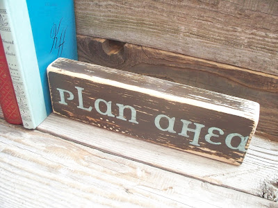
Here's the straight-from-camera shot:
And here's the Photoshopped version.
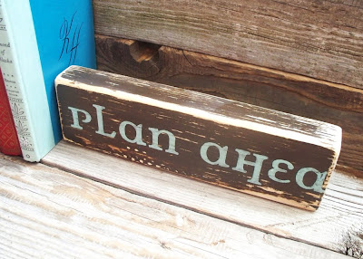 Both photos are nice. Photoshop just helped to bump up the contrast and crop the photo. It also makes it easy to meet Etsy's rule that uploaded images can't be over 1000 pixels wide.
Usually when I edit a photo in Photoshop, I do three simple things.
1. I crop the photo using the crop tool.
2. I use the Curves tool (Command+M) to tweak the contrast and the white balance (About white balance- When parts of the photo that are supposed to be white, aren't, you can use the Curves tool to fix it.).
3. I resize the image down to 1000 pixels in Image>Image Size.
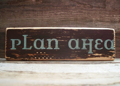 Lighting is a key factor in photos. In fact, I'd say it's the NUMBER ONE most important thing. If you don't get the lighting right, it's hard to capture a photo that's workable.
It's also the number one thing I've struggled with most! Here's what I learned about lighting:
1. Since it's winter and I don't want to haul everything outside and risk ruining my hard work, I take my photos beneath a south-facing window that lets in a lot of light. I don't use any special light bulbs or equipment.
2. When our crazy Utah weather is not changing from blistering sunshine to blizzard every 3 minutes, I like to take photos outside. The light is best in late afternoon, about 4-5 o'clock. I've tried to take photos at noon before, and the light is just too harsh. If the sun is beating down, or you don't have time and you've got to do your photographs during lunch, try to find an area of open shade, somewhere that's getting light but that doesn't have the sun shining directly down on it.
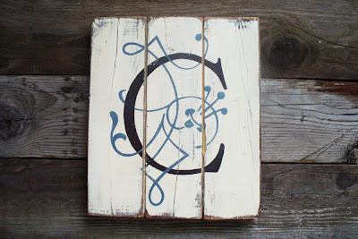 Another challenge is my beautiful son... He's a sweetheart, but sometimes he likes to "help" a little too much! When I was photographing the Princess plaque, he WOULD NOT leave me alone. I tried to distract him with toys and games and he just wouldn't have it. So I just let him be a part of the photos that day. In the end, I thought his cute little baby toes worked in the photos, so we were both happy. Sometimes you just have to roll with it. You never know when something that you thought was a problem turns out to be a good thing.
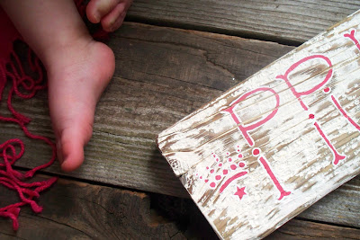 Another thing is, get creative with your backgrounds and props.
 The two main backgrounds I use right now are:
1. Some old boards that I got from my grandpa's farm. I just push them together and set my products on top. When I'm not using them, they sit in a stack under the window, where I can pull them out in about 20 seconds if I need to use them. They are GREAT, especially for colorful items. Plus, they fit in with my love for the distressed and vintage look. The best part was, they were free!
2. A big map. I bought it as a souvenir from my time living in Ukraine. It's a map of Kiev. The babushka I bought it from thought it was not very beautiful, so I ended up buying another map from her that she said was much prettier. I happen to disagree, I think the first map was gorgeous and it makes a GREAT background!
When it comes to props, I don't buy anything. I look around my house for things that I already own that I think would look cool in my photos. Usually I try for a pop of color with my props, but just a small amount because I don't want my props to overwhelm the product I'm photographing.
Anyway, the point is, just dig around in your old stuff, or ask friends and relatives if they've got anything you can take off their hands, or drive around your neighborhood and take a look at the colors and textures of your environment. You'll find something that will work perfectly, for your products and your personality.
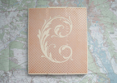 Try for a variety of shots. This one is important because customers will want to see the product from more than one point of view. I usually try to get three types of shots when I'm taking photos of something.
1. The hero shot. This means there's nothing but your item and the background. Clear out all the props so the item is the only thing. Usually I photograph the item straight on for my hero shots.
2. The close up shot. People want to see the texture and workmanship of the item. This is where Macro is especially helpful.
3. The angled shot. This is for when you've got a 3-D item. The purpose is to show it from another angle so that the customer can see thick, thin, matte, shiny, etc.
Last, but not least, even if you own a little cheap point-and-shoot, chances are it still has a few features that are worth taking advantage of. Get to know the user guide to your camera. Here are some things that I use regularly on my good ole Kodak EasyShare:
1. The option to turn off the flash. If you have good lighting, there's no need for a flash that will usually just create a weird bright spot and mess up your beautiful photo.
2. Tripod. Not every camera comes with one; mine did. It's tiny, but it works. If you don't have a tripod, you could use a stack of books or other such things to create a little stand for your camera. It works great when you need your camera to be level with your item.
3. Timed capture. You know the one, where you can set a timer for your camera to take the photo. I use this a lot because my hand pressing the button almost always makes the camera shake and it blurs the photo.
4. Macro mode. I've taken lots of good photos just with the auto mode, but if your camera has a macro mode, it might be worthwhile. I've found that my camera does really well with macro as long as I don't hold it too close to the item.
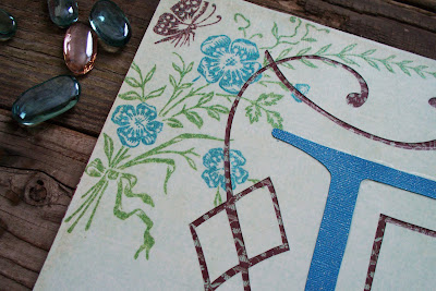 I really hope that was helpful to somebody out there who, like me, struggles to take good, professional-looking photos with their itty-bitty point and shoot. And after all is said and done, I think the best advice is to just be yourself in your photos. They've got to reflect your own unique style and personality.
Good luck, and happy photo shoots to you!


